
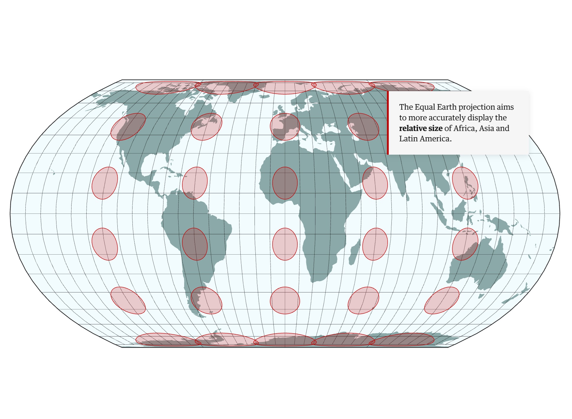
The UN’s adoption of the Equal Earth projection offers a long-overdue alternative to the 16th-century Mercator map—and sparks unexpected diplomatic drama.
For centuries, the world has been looking at itself through a distorted lens.
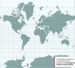
The Mercator projection, created in 1569 to help sailors navigate the seas, has dominated how we see our planet for over 450 years. But critics have long argued it gives a misleading impression that northern hemisphere nations are larger than they actually are—subtly reinforcing perceptions of where global power lies.
Last week, the United Nations General Assembly voted to adopt a new map that aims to set the record straight.
A New Way of Seeing the World
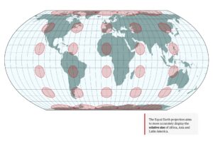
The Equal Earth projection, developed in 2018 by three cartographers, more accurately represents the relative sizes of all continents—particularly Africa, Asia, and Latin America. The UN resolution, put forward by Togo, passed with overwhelming support: 164 countries voted in favour.
“I view the Equal Earth maps as living documents and am grateful for the many helpful suggestions that I have received,” said Tom Patterson, a renowned US national parks cartographer who came out of retirement to field questions from governments worldwide.
The only “no” vote came from the United States, whose UN representative dismissed the effort as “barnacles on our work here.” Six other nations abstained.
The Problem with Mercator
Maps are notoriously difficult to make. Cartographers must unfold our spherical Earth onto a flat surface—a mathematical impossibility without compromise. The Mercator projection solved one problem (navigation, since straight lines match compass bearings) but created another: it dramatically enlarges areas toward the poles.
“These circles, which would look equally sized on a globe, show how Mercator enlarges areas toward the poles,” explained Bernhard Jenny, an associate professor at Monash University in Melbourne.
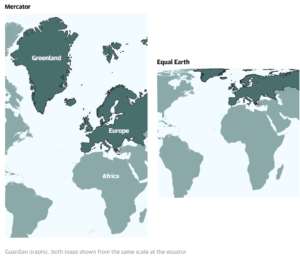
The result? Greenland appears roughly the size of Africa on a Mercator map, when in reality Africa is 14 times larger.
Diplomatic Complications
The adoption hasn’t been without controversy. Japan requested revisions because the map placed the disputed Kuril Islands in the same shade of yellow as Russia. Ukraine abstained, objecting that Russian-occupied Crimea appeared as a different colour from the rest of the country.
The cartographers say these objections stem from a misunderstanding. The map voted on at the UN is simply a mathematical projection of land and sea—without human-made borders or shading. The confusion arose from Patterson’s website, which offers free Equal Earth projections annotated with geopolitical lines.
The Art and Science of Mapmaking
“It’s like the orange peel analogy,” said Jenny. “You have to tear it and stretch it, and it’s not possible to flatten it out … so you have to make compromises.”
For Jenny, cartography is about aesthetics as well as science. “We cartographers say cartography is the art and science of making maps. So it’s kind of the combination of the two.”
The Equal Earth isn’t the first attempt to address Mercator’s shortcomings. The Gall-Peters projection, developed in the 20th century, shows true relative sizes but often appears oddly elongated. “There was a lot of backlash from cartographers who said: ‘Well, it looks like clothes are hung up to dry,'” Jenny recalled.
Questioning Fundamental Truths
Spend time with a cartographer, and what might seem like fundamental truths quickly break down. “Which way is up?” or “Where is the centre?” are not simple questions.
Ancient Islamic maps had a south-up orientation, placing Mecca in the eyeline. A London-centric worldview has long dominated, with Greenwich at the centre.
“You have to make compromises,” said Jenny. The Equal Earth map, for example, isn’t useful for navigation, as countries on the edges are squeezed. If any country had a claim to be upset, it might be New Zealand, which appears stretched and distorted on the map’s periphery.
“A map is never neutral,” said Jenny. “So you cannot please everyone.”
A Cartographer’s Dream
Bojan Šavrič, the “maths wizard” of the trio who worked on the mathematical formula, said he never imagined their research would be discussed at the highest levels of international diplomacy.
“What pleases me more is that this creates a valuable opportunity to strengthen map literacy and raise awareness that there is no single map projection capable of providing a completely ‘true’ representation of the world,” he said. “Every map projection involves trade-offs.”
Jenny watched the UN proceedings from Australia with delight. “It’s kind of a cartographer’s dream, right? The fact that the UN is debating map projections for an entire hour is already totally thrilling for cartographers, and then it was our map projection. I mean, what else can you ask for?”
He does, however, have a hunch that another factor helped: the power of a good name. Had they called it the “Šavrič-Patterson-Jenny projection,” he joked, maybe it wouldn’t have done so well.
The Equal Earth projection is hoped to gradually replace Mercator on school walls and government websites, offering future generations a more accurate view of our shared world.
Reference: Telegraph